
Marketing Advice That Matters


Eye catchy postcards which offer inexpensive and effective marketing avenues for businesses always need good design. A good postcard design will help your business stand out in crowd and enhance the chances of readability for your message. Colorful, eye catchy and effectively written with simple short and sweet words make great postcards. Good design is not alone that takes all the credit for making a mark, good printing is equally important.
A business postcard must impel a positive reaction from the recipient. Ask yourself whether your postcard after getting printed with desired effect convey the right visual message. Secondly, ask yourself whether the custom postcard printing 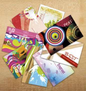 and design looks too common in comparison to too many other postcards sent by marketers. While the answer of the first question should be positive, the second one must be answered negatively if you are on right track. Here below we provide some helpful tips.
Maneuvering visual elements
Images and color should emphasis the purpose and have positive effect on the recipient. Taking an image from the web may not sufficient always. Sometimes you may need to spruce up the image a little bit with patches of artwork or graphic design. Graphic design alone can serve the purpose pretty well sometimes.
• The color should relate your brand to a certain extent. Make sure the design is consistent enough with your website, store and branding avenues.
• When using images from stock image sites make sure that you find the best contextual and uncommon image with effective potential.
• Make sure the postcard carries a custom business logo among other visual elements.
Optimizing readability of postcard content
Keeping it bright, brief, to the point with sweet use of catchy words and sentences make a great postcard using variable printing services. Readability should be optimized by design and maneuvering text font complementing that design element. Here below the key tips.
• Avoid visual clutter with too much text on the postcard.
• Use negative space or white space around content to enhance readability and attract attention.
• Your postcard should not inform everything on the spot. Rather it should only play as the teaser to motivate the recipient to contact you further.
• Avoid putting dense content as no one bothers these days to read so much on a marketing literature.
• Using highlighted words like “Free” or “50% Off” or “Free Gifts” to catch attention.
• Do not use too many different font sizes. Restrict yourself to one or two.
Go big while printing postcards
Finally, it is the size of the postcard that matters as well. Yes smaller postcard deserves more attentiveness from the recipient which is really hard to get. On the other hand, offering unusually bigger size of postcard (http://en.wikipedia.org/wiki/Postcard) you are bound to be watched and cannot be ignored. Moreover, even when the postcard draws no attention from the recipient, it can even be read from a distance. Thus bigger postcard always makes sense and is more apt to deliver leads for you.
Quality paper with appropriate texture
It is the quality of the paper that helps the design to stand out. So choosing cheap quality paper you are actually wasting the design output. Appropriate texture befitting to your desired look and feel is also crucial to make an effect. For quality full blown images using glossy paper can be effective. But for postcards with mainly text messages matte finish can be appropriate. You can also use two different texture and paper quality on both sides.
